An opinionated guide to designing a photography site
I’ve been taking photos seriously for the past five years. During that time I’ve put a lot of time thinking about how to display photos online. Mainly because displaying your photos online with a modicum of quality is hard. I wanted to share my learnings and conclusions on the subject in the hope that it may prove useful.
Consider the photo book
Sure, books haven’t fared so well these past twenty years or so. We all know the convenience of accessing content online, but convenience doesn’t equate to effectiveness. The book format is simply a superior format for communicating the concept and vision of photographic work (I’ll get into why later).
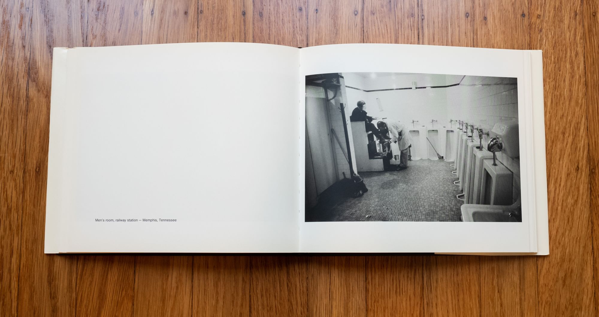
 Robert Frank’s The Americans
To be honest, you’re starting in the hole by publishing your work online. My suggestion is to take what’s best about the photo book format and translate it as best as possible into an online format.
Easier said than done.
What makes the photo book so much better?
Well, they have a distinct advantage. The book’s format never changes so photographs can be laid out explicitly to support the vision of the photographer. The book has a built-in interface (e.g., pages) so there’s no need for pagination or navigation or any other mess. The photos don’t need to be loaded, the book never encounters runtime errors, there’s no issues with rogue colorspaces, need I go on? A photo book can simply be about photos.
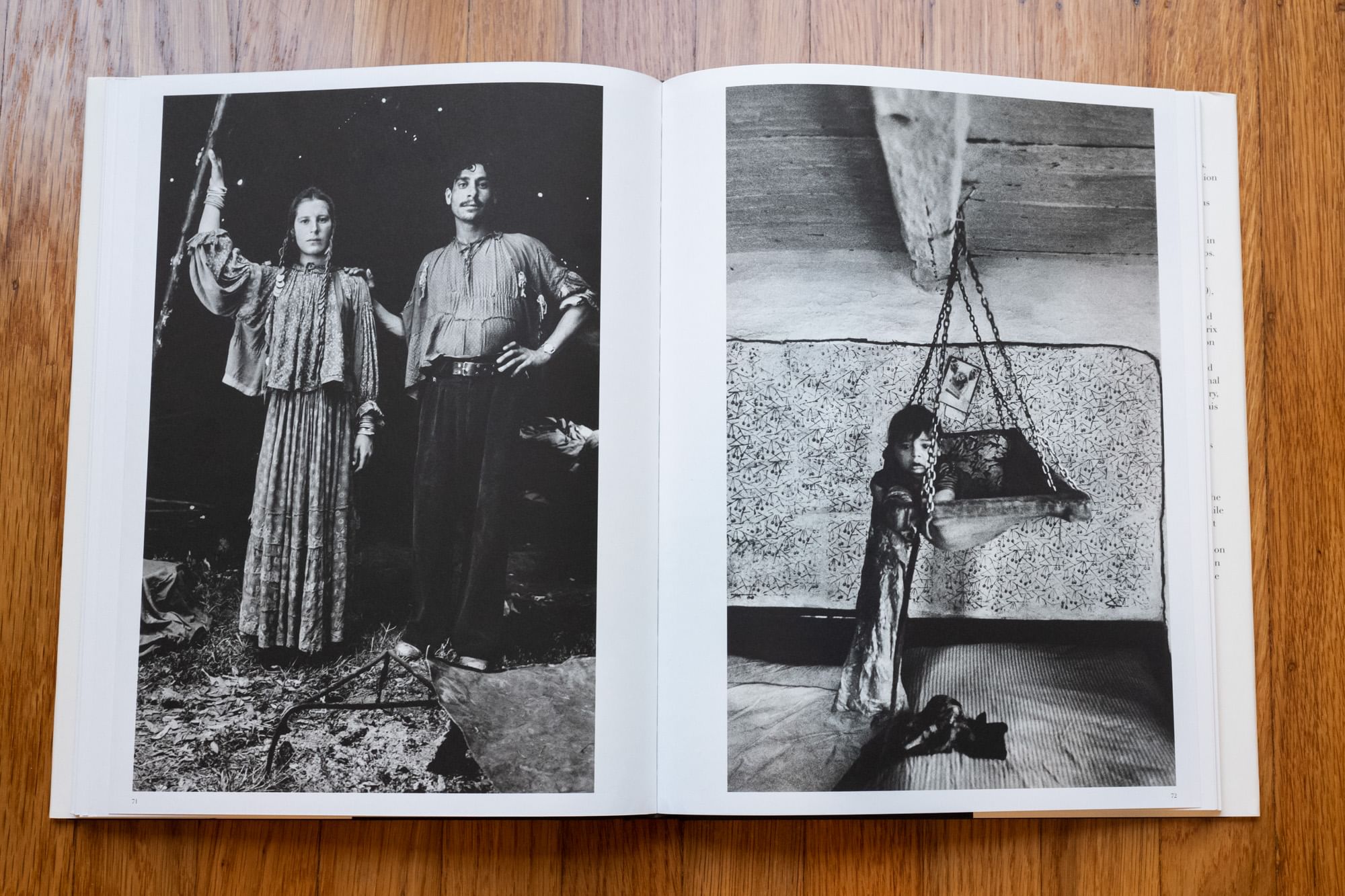
 Josef Koudelka’s Gypsies
The static nature of a photograph is a perfect fit the the static nature of a book. The photo books I resonate with do amazingly little more than present photographs how the photographer intended them to be seen. That is incredibly difficult to do in the web format. But that’s your job nonetheless.
So, what’s this mean?
This means that the process of designing a photography site is to remove as much from the screen other than the photographer’s intent. Just like the photo book’s spreads are intended to support the photographer’s style and message, so to should the site’s design. Support is a key word though—the interface should be firmly in the backseat.
That doesn’t mean the design isn’t important—of course it is. Design choices will be critical to support the message based on the subject matter, format, aspect ratio, etc. All of those choices summed up will lead to a unique set of design choices to best communicate the work.
So, put the photo front and center, develop a layout specific to the work and remove everything else. Easy to say, hard to do.
Hard for many reasons
Just the technicalities to achieve the above are difficult. Developing a layout design that supports the work is usually even more difficult. However, the most difficult thing of all may be fighting your own impulses.
The great thing about great photo books is that they’re focused. They usually encompass a single project and there’s little more in the book other than the work.
On the other hand, the vast majority of photography sites are exponentially larger in scope. They contain a photographer’s entire body of work, which necessitates navigating through projects. Then there’s the whole other litany of content the site supports, such as a bio, contact info, press, etc. Once you actually get to the content, there’s typically some UI to paginate/navigate through content.
Then there’s the invisible stuff which still ends up complicating matters. Modern sites often have custom typefaces which puts a strain on bandwidth. Don’t forget your analytics tracking, cookies, etc. Lastly, there’s the omnipresent social media buttons… I’ll leave that subject be, but suffice to say, it’s not helping showcase the work.
Mind you, the photograph hasn’t even been mentioned yet.
All of the above are voluntary, self-inflicted wounds that get in the way of the work. It’s your job to hide or preferably remove as much of the above as possible.
Let’s get concrete
I can’t tell you how do best display work I haven’t seen to convey the message I’m unaware of. However, I can give you some general suggestions to best set you up for success. First and absolutely foremost…
Do not, under any circumstances, touch the photo
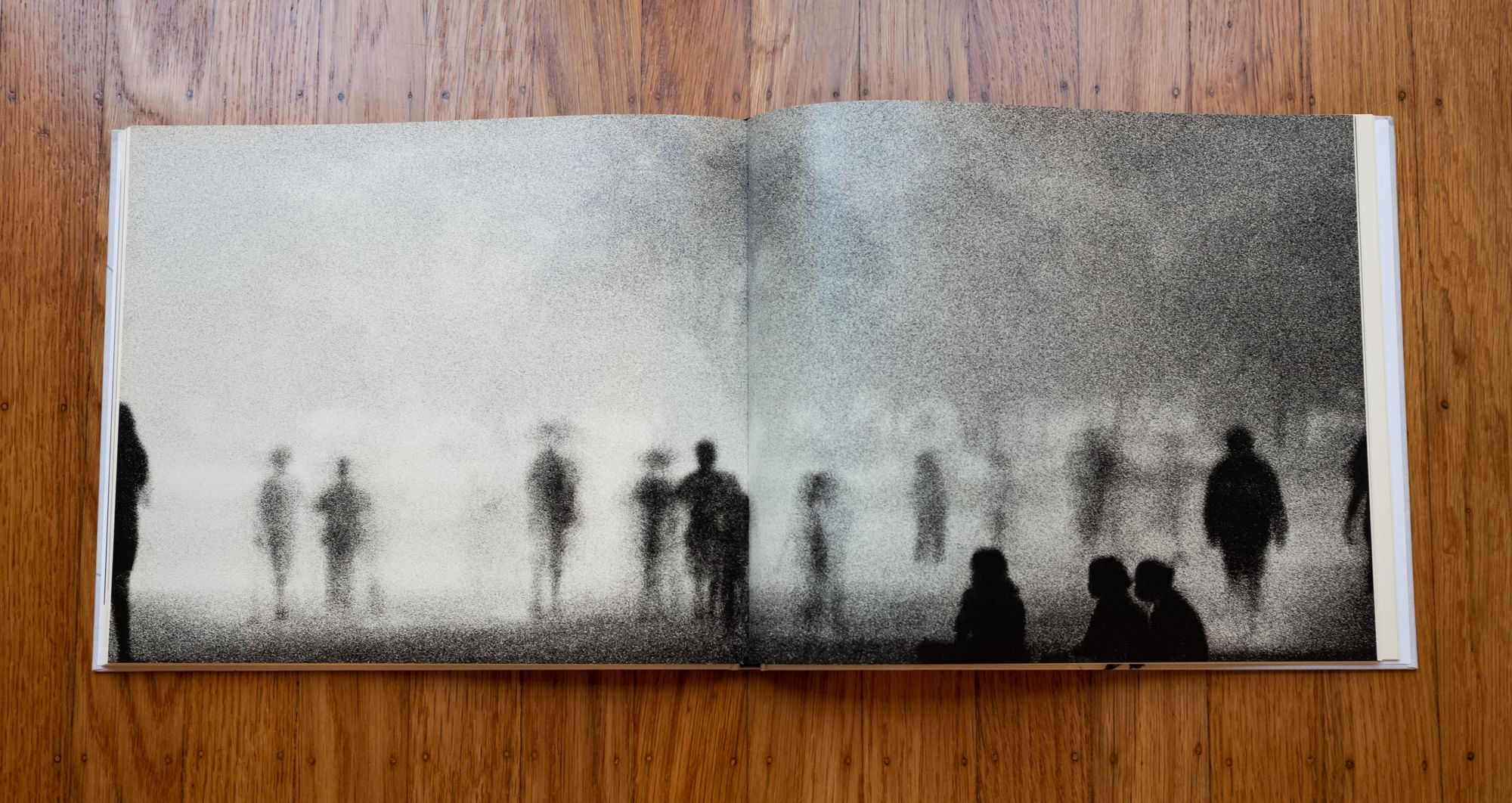
The only entity that should be making creative decisions on the photography is the photographer. That seems straightforward, but it’s often ignored. Photos are often cropped to allow them to be full bleed on the screen—this is horrible. This effectively allows an arbitrary window size on someone’s device make the creative decision on how to crop the photo.
 Trent Parke’s Minutes to Midnight. This photo was almost assuredly cropped, but done so with the creative intent of the photographer. Big difference.
On top of cropping, don’t cover it up. Don’t put captions on top of your photos—because then you often need an overlay background as well. It’s just a mess. Just put the text below the image.
Lastly, hover effects that mutate the image (e.g., scaling, opacity changes, color overlays, etc.) are a no go. You have no control over where a viewer moves their mouse—all you’re doing is setting up situations where the photo is not rendered how it was intended to look.
Note, the above doesn’t apply to cases when you’re using photos for navigation. But if you’re displaying a photo for the sake of people looking at it, please just leave it be.
Make the photo big
It’s a photography site, right? The photo should be the primary subject. That means you need to find ways to get as much off the screen as possible to give the photograph room to be large. Navigation, pagination, footers, social media buttons—they’re all getting in the way.
That said, I’d suggest not going full bleed—mainly because in doing so there aren’t explicit bounds to the photo. Is the photo being cropped by the screen or is it actually this size? Creating some margins around the photo removes that question.
Show the photo quickly
This is a bit more technical, but you really need to devote time and effort to get the photos to show up fast. Having an effective compression strategy, displaying an appropriately sized image for the screen size it’s being view on and image lazy-loading will all help. Make this a priority—it’s critical.
Not to beat a dead horse, but not loading social media buttons, analytics and other unnecessary distractions will help your site (and your photos) load faster.
Keep the rest basic
If you’re doing the first three things effectively, your next job is to do as little as possible to just not screw it up. Photography sites are about photography. They’re not about motion treatments, typographic self-aggrandizement or sophisticated UI designs. Beautifully vibrant or moody subtle colors should be coming from the photographs, not from the site design.
In short, the more anything else grabs the viewer’s attention, the less the photos will. That’s bad.
Ignore any/all of the above if it conflicts with message you’re trying to convey
Obvious, but worth explicitly calling out.
How can I make this happen?
Well, that’s the rub. When I went about putting my photos online, I had absolutely no intention to build my own site. It was time consuming and laborious. The problem is that I couldn’t find a single solution, free or paid, that met these needs. There isn’t a single photo site template that’s designed to meet anyone’s specific needs. That’s the exact opposite purpose of templates—they’re intended to be flexible. But in that flexibility I failed to see how most met anything more than the baseline criteria of getting your photos to show up in a browser.
This (unfortunately) meant that I had to make my own site. This also means I’m implicitly suggesting the same to you as the reader. Which is what most people probably do not want to hear. But first things first, I highly suggest you go to a library and look at some photography books. A good place to start is The Americans and/or The Suffering of Light. Give them a gander and see if the format resonates with you. If so, the work will be worth it.
Prologue
At the risk of getting too philosophical, now is a good time to ask yourself why you want a photo site to begin with. If the honest answer is that you want to make a name for yourself or grow a social media following then you’re in luck! Don’t waste your time wrestling with how to best display your photographic work on this inhospitable platform. Just sign up for Instagram and post your work there—it’s honestly a better use of your time.
However, if you’re looking to present your work with as much creative control as possible and don’t have a publisher or gallery knocking on your door to help make that happen, you may be stuck where I was. Hopefully a little further ahead after reading this.